
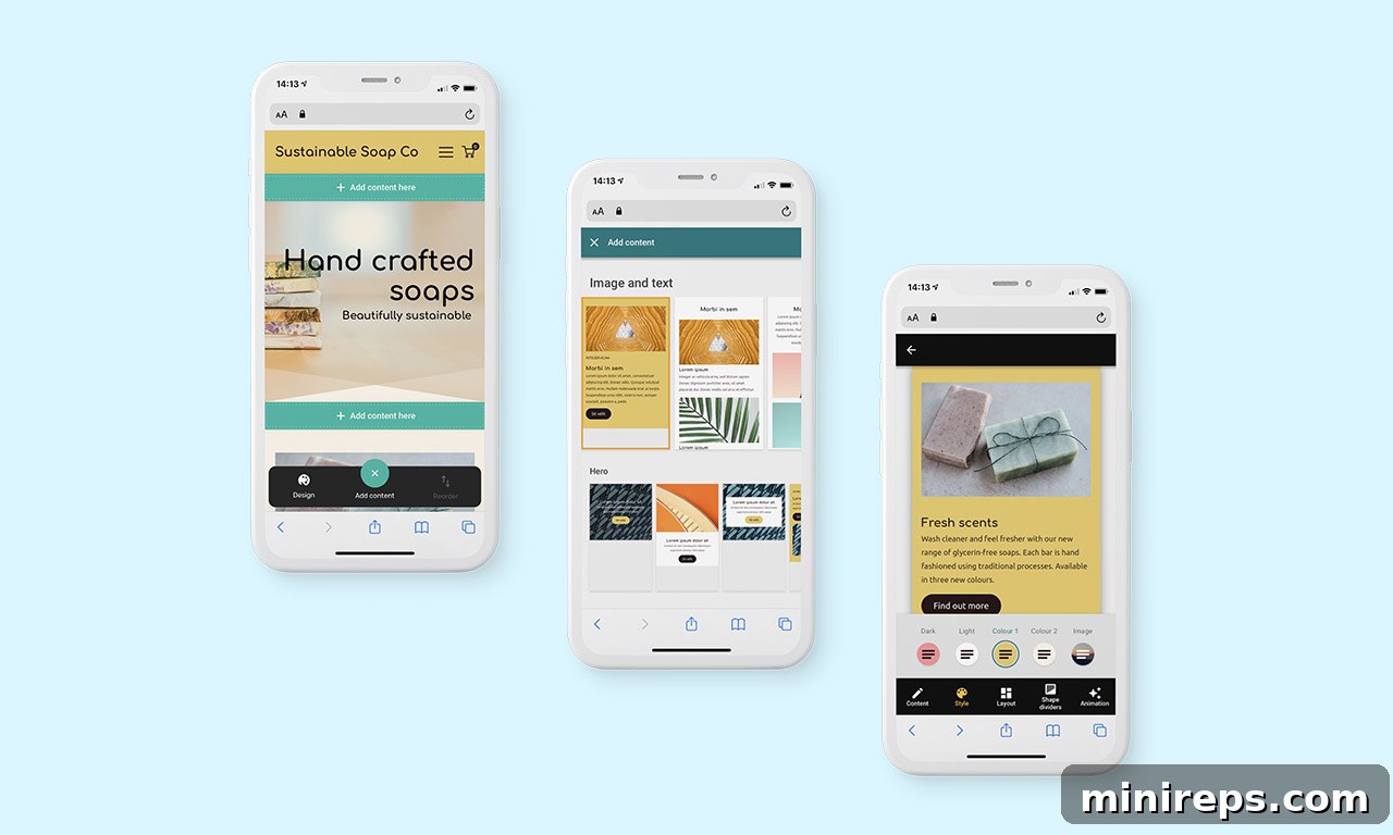
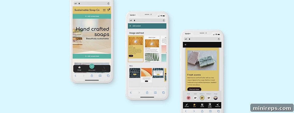
In today’s fast-paced digital landscape, establishing a compelling online presence is no longer a luxury but a necessity for individuals and businesses alike. Whether you’re a budding entrepreneur, a seasoned professional, or an artist showcasing your portfolio, having a website that truly represents you is paramount. Our Easy Website Builder has always been designed with this vision in mind, offering a powerful, intuitive platform to create stunning websites and functional online stores within minutes. It empowers users of all technical skill levels to bring their digital dreams to life, seamlessly adapting to any device.
Current users already appreciate the simplicity and efficiency of our builder, which provides a rich selection of pre-designed sections, each offering unique styles and layout options. This flexibility allows anyone to craft a professional, beautifully designed website that stands out and perfectly aligns with their brand or personal vision. However, we believe in continuous improvement and pushing the boundaries of what’s possible. We’re thrilled to announce that the Easy Website Builder is receiving a significant, game-changing upgrade, introducing an entirely new, streamlined, and profoundly simplistic approach to website creation. This isn’t just an update; it’s a complete reimagining of the site-building experience. Dive deeper to discover the revolutionary changes that await you.
Experience the Future of Site Building: Easy Website Builder’s Transformative Upgrade
For many, the prospect of creating a web presence can seem daunting, often associated with high costs and complex technical hurdles. We understand these challenges, especially for busy individuals and small business owners who need to establish a strong online footprint quickly and efficiently. The core objective behind this monumental upgrade is to democratize website creation, making it as intuitive, accessible, and fast as interacting with your favorite social media platforms. Imagine a website builder that’s easy to learn, lightning-fast to use, and always within reach – that’s the experience we’re delivering.
This new version of Easy Website Builder marks a paradigm shift in how you’ll construct your digital storefront or personal site. Key distinctions from the previous iteration include a foundational move towards flexible content sections instead of rigid templates, the complete removal of cumbersome drag-and-drop technology, and a thoughtfully reimagined toolbar. Each of these improvements has been meticulously designed to significantly elevate your website building journey, making it more fluid, efficient, and enjoyable. We’ve stripped away complexity to spotlight creativity and user satisfaction.
Upon entering the upgraded editor, you’ll immediately notice a cleaner, less cluttered interface. There are fewer buttons to navigate, fewer controls to master, fewer panels to manage, and fewer pages to get lost in. This simplification is intentional, aimed at reducing cognitive load and accelerating your design process. Instead of sifting through a vast library of templates and laboriously dragging and dropping individual elements into place, you’ll now engage with an extensive library of pre-formed ‘sections.’ These sections cover a comprehensive spectrum of content layout possibilities, from hero images and product galleries to testimonials and contact forms. This innovative approach eliminates the need for repetitive drag-and-drop interactions, ensuring that every layout you choose not only looks stunning but is also perfectly optimized and responsive across all screen sizes, right out of the box. This means your website will look flawless on desktops, tablets, and smartphones without any additional effort on your part.
Perhaps the most transformative aspects of this upgrade, underscoring our commitment to modern web standards and user experience, are:
- A New Focus on the Mobile Experience: In an increasingly mobile-first world, your website must shine on smaller screens. This upgrade places mobile responsiveness at its very heart, ensuring your site looks and performs impeccably for every visitor, regardless of their device.
- Saying Goodbye to Drag and Drop: We’ve evolved beyond the limitations of drag-and-drop. Our new section-based system offers a faster, more precise, and visually consistent way to build pages, eliminating the frustrations often associated with pixel-perfect positioning.
- Interactions are Completely Thumb-Friendly: Recognizing the prevalence of mobile browsing and editing, the entire interface has been optimized for touch, making on-the-go site management and updates seamless and natural.
- Design Excellence for All Screen Sizes: Our commitment to delivering professional-grade aesthetics extends to every device. The new builder automatically ensures your design is beautiful, functional, and consistent across desktops, tablets, and smartphones, providing a truly universal high-quality experience.
Enhanced Features and Unrivaled Improvements for Easy Website Builder
Rest assured, all the beloved features you’ve come to rely on within the Easy Website Builder are still present, but they have been meticulously redeveloped and refined. Each enhancement has been crafted with your convenience and creative potential in mind, presented in a fresh, inspiring, and incredibly intuitive manner. We are eager for you to explore these innovations firsthand and unlock new possibilities for your online presence. Without further delay, let’s delve into the specific improvements that will redefine your website building experience.
Streamlined Widget Panel Experience
The widget panel has undergone a significant overhaul to provide a more visually appealing and highly functional experience. These improvements are designed to make finding and utilizing essential tools quicker and more intuitive:
- Modern Visual Design: Enjoy a refreshed and contemporary aesthetic that enhances readability and reduces visual clutter. The new design puts your content front and center.
- Left-Hand Side Placement: The widget panel now conveniently opens on the left-hand side of the editor, aligning with common design software conventions and creating a more natural workflow. This placement keeps your primary workspace unobstructed.
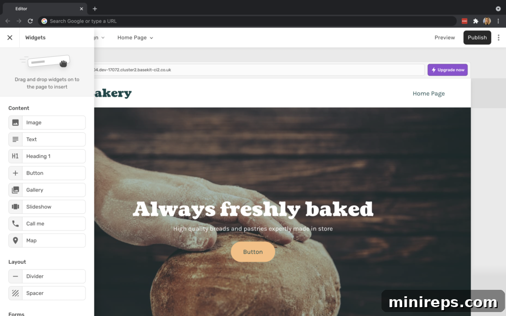
Further enhancements ensure that managing and selecting widgets is more efficient than ever:
- Single-Column Display: Widgets are now elegantly displayed in a single column, simplifying navigation and making it easier to scan through available options. This clean layout significantly improves the user experience, especially on smaller screens.
- Hover-Over Functionality Details: Gain immediate insight into each widget’s capabilities. Simply hover your cursor over any widget to reveal a brief description of its functionality, helping you make informed choices without needing to click or search.
Intuitive Toolbar Enhancements
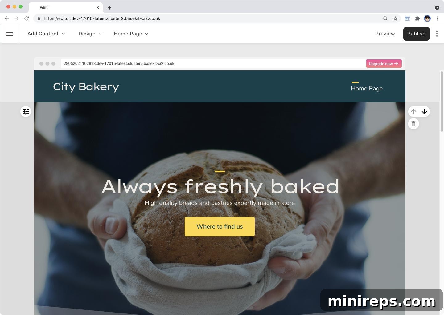
The toolbar has been completely redesigned to enhance clarity, usability, and accessibility, ensuring that your most important actions are always just a glance away:
- Clearly Labeled Buttons: Gone are the days of deciphering abstract icons. Actions previously represented by icons have been replaced with descriptive, clearly labeled buttons. This dramatically improves accessibility and reduces the learning curve for new users, making every function immediately understandable.
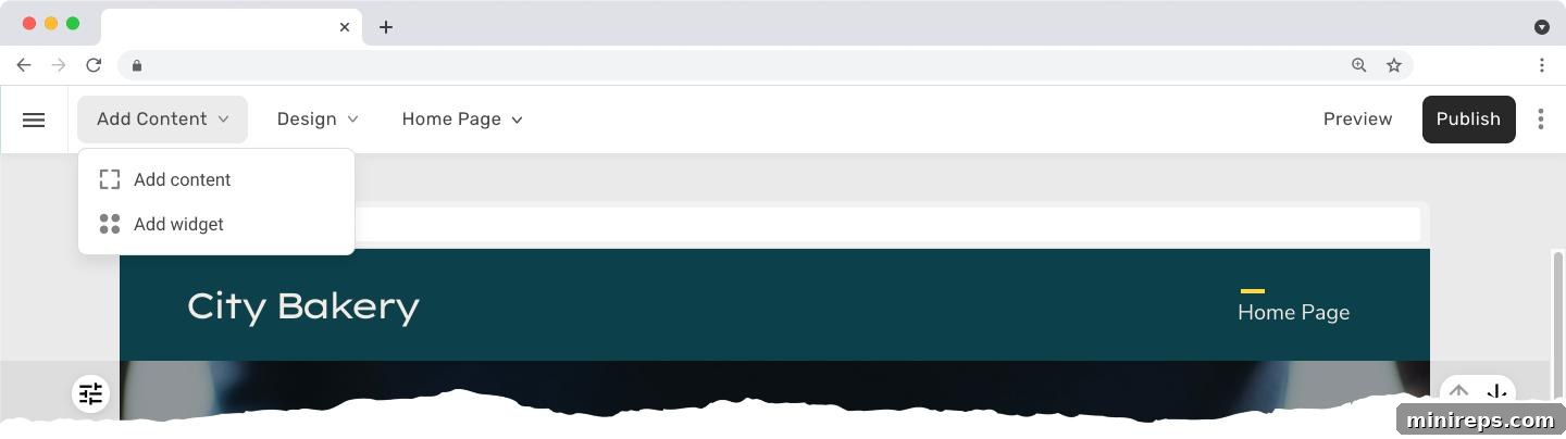
Further enhancements transform the toolbar into a more efficient and user-friendly command center:
- Revamped Visual Design & Usability: Experience a sleek, modern visual design that not only looks great but also significantly improves usability across both desktop and mobile devices. The cleaner interface minimizes distractions.
- Lighter Visual Style: The updated visual style features a lighter, more minimalist aesthetic. This intentional design choice removes unnecessary visual clutter from the editor, ensuring that your website itself remains the sole focus of your attention.
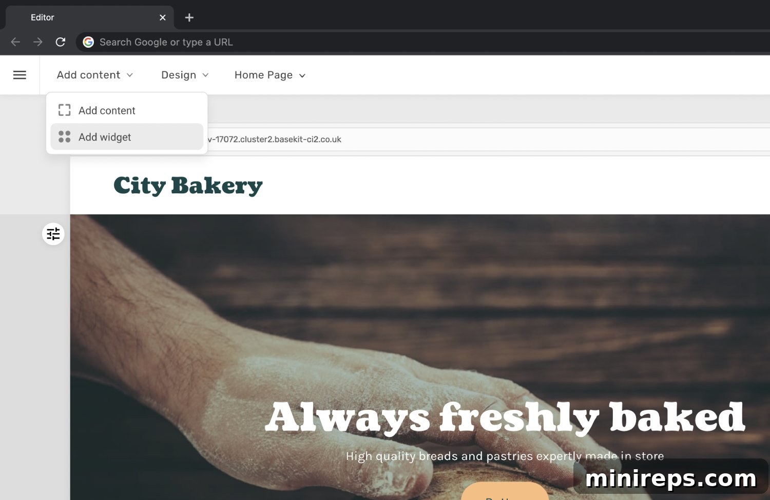
- Intelligent Control Grouping: Essential controls for adding content, toggling design mode, and switching between pages have been strategically relocated and grouped within consistent dropdown menus at the top left of the editor. This intelligent organization allows for quicker and more intuitive access to the functions you use most frequently, streamlining your workflow.
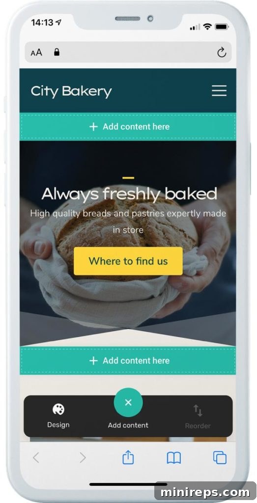
Recognizing the importance of mobile editing, the new toolbar excels on smaller screens:
On mobile devices, these critical actions are now ingeniously presented within a new floating actions bar positioned conveniently at the bottom of the screen. This thoughtful placement ensures that all essential controls are comfortably within thumb’s reach, making mobile editing a truly effortless and enjoyable experience. You can manage your site updates and content on the go with unparalleled ease.
Simplified Content Addition Process
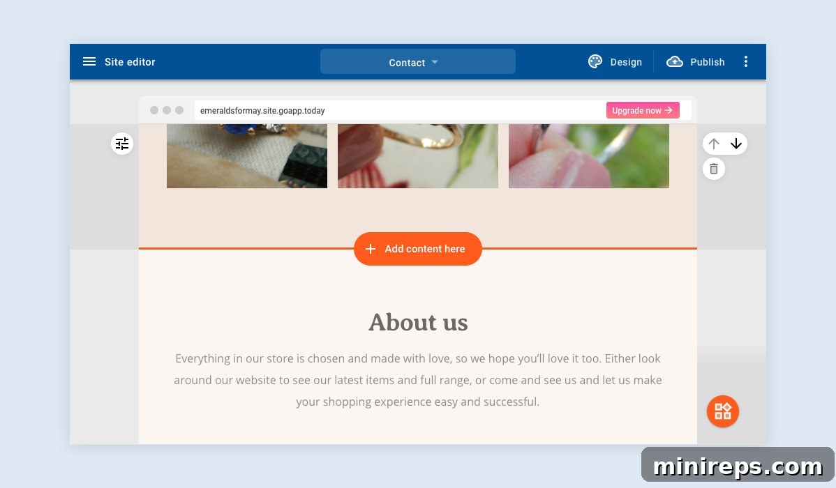
Adding new content to your website has never been more straightforward or efficient. We’ve redesigned the process to be faster and more intuitive, removing any unnecessary steps:
- Reduced Clicks for Content Addition: We’ve significantly streamlined the “add section” process by eliminating superfluous clicks. This makes adding new content quicker and more direct, allowing you to focus on your design rather than navigating complex menus.
- Prominently Visible “Add Content Here” Button: The “Add content here” button is now more visible and strategically placed, guiding you naturally to where you can expand your website’s content. Its clear prominence ensures you’ll always know how to insert new sections.
- Hover-and-Click Interaction: The previous manual drag-and-drop method for adding content has been replaced with a more efficient “hover-and-click” interaction. Users now simply hover over any existing section on their page and click the intuitive “Add content here” button. This action instantly opens the comprehensive section library, from which they can effortlessly choose the desired section type, placing it precisely where they intend. This new flow dramatically speeds up page construction and ensures layout consistency.
Powerful Text Editor Enhancements
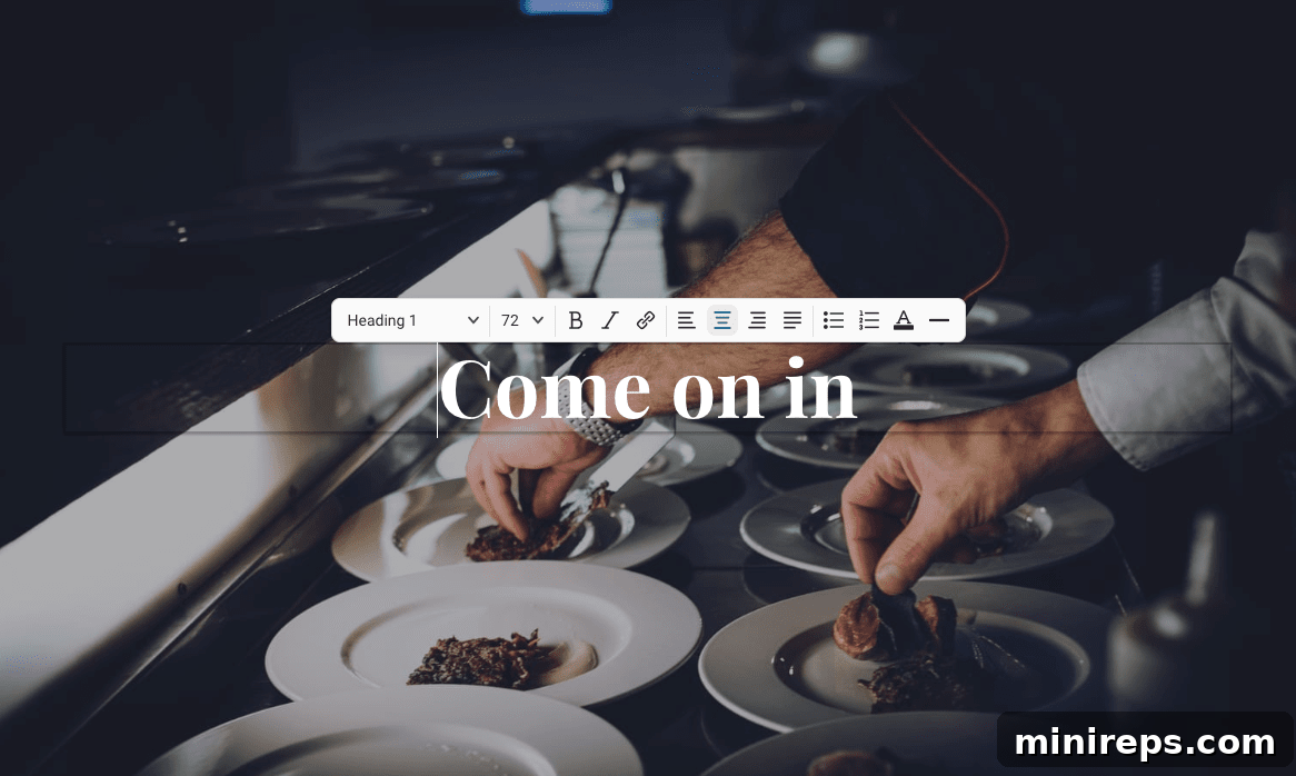
The text editor is a cornerstone of content creation, and we’ve enhanced it to provide greater control, improved aesthetics, and more versatility for your written content:
- Expanded Options: The editor now boasts a richer set of formatting and styling options, empowering you to create more dynamic and visually engaging text.
- Refined Design: Experience an improved, sleeker design for the text editor itself, which makes editing a more pleasant and less distracting task.
- Inline Text Size Control: Gain precise control over your typography with the newly added inline text size option. This allows you to adjust font sizes directly within your content, enabling fine-tuned visual hierarchy and emphasis without leaving the editor.
- Integrated Divider Option: Easily break up large blocks of text and improve readability with the new divider option. Add horizontal lines to create clear visual separation between content elements.
- Enhanced Link Management: Our improved link management system makes inserting, editing, and managing hyperlinks more intuitive and robust. Connect your content with internal pages or external resources seamlessly.
Dynamic Slideshow and Gallery Improvements
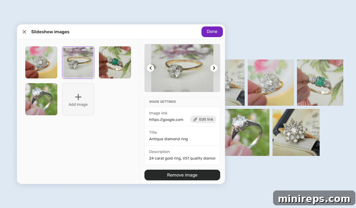
Visual content is key to engaging your audience, and our updated slideshow and gallery features offer superior control and visual appeal:
- Enhanced Visual Design and Usability: The settings for galleries and slideshows have been meticulously redesigned for improved visual clarity and ease of use. Managing your image collections is now more intuitive than ever.
- Brand New Image Management Panel: Introducing a powerful, dedicated image management panel that puts you in complete control of your visual assets:
- Quick Add and Remove: Effortlessly add new images or remove existing ones from your galleries and slideshows with streamlined controls.
- Reorder and Customize: Easily reorder your images to tell your story exactly how you want. Furthermore, you can now add specific image attributes such as titles, descriptions, and links directly within the panel, enriching your visual content with vital information and interactive elements.
Precision Image Aspect Control
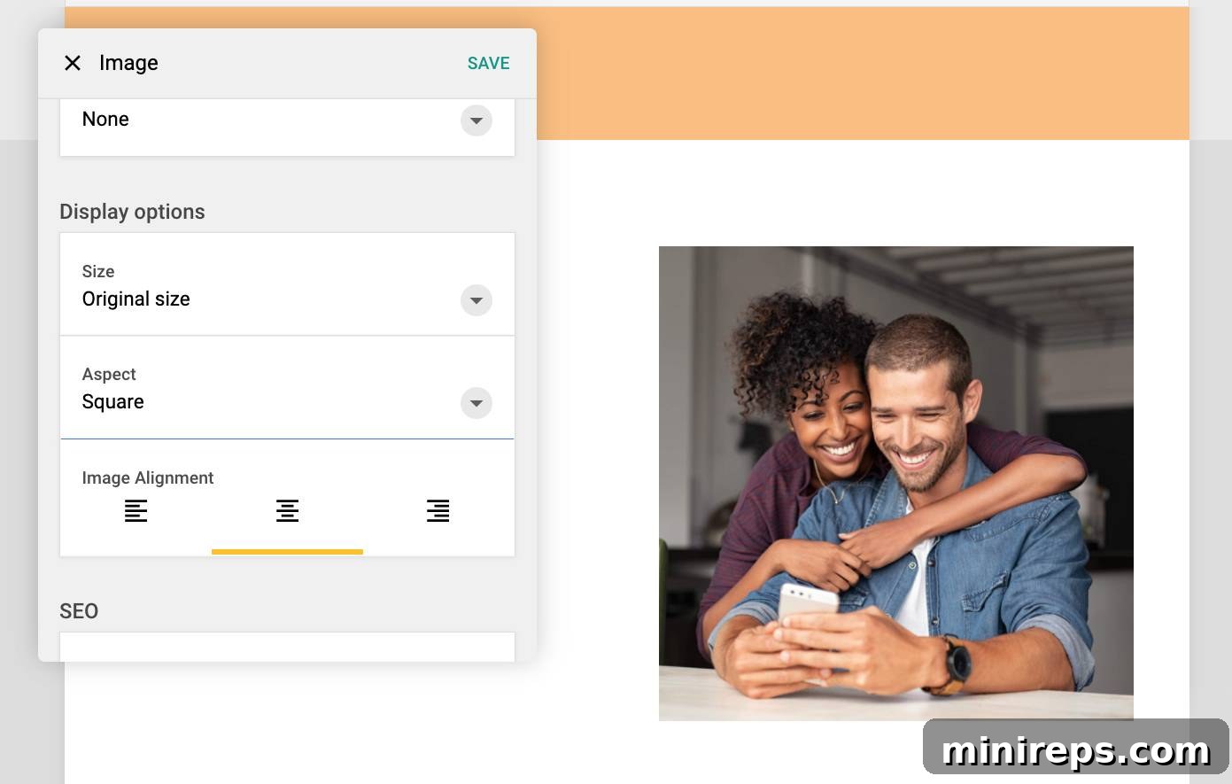
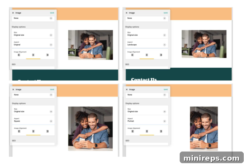
Achieve visual harmony and professional-grade image presentation with our new Image Aspect Control. This feature simplifies image formatting dramatically:
- Effortless Image Display Control: The innovative Aspect setting grants you unprecedented control over how your images are displayed on your website. You no longer need to manually edit images in external software to achieve specific shapes or proportions, saving you valuable time and effort.
- Versatile Aspect Ratios: Seamlessly edit and display your photos in three widely used and aesthetically pleasing aspect ratios: Square (1:1), Landscape (e.g., 16:9, 4:3), and Portrait (e.g., 3:4, 9:16). This flexibility ensures your images always look their best, perfectly fitting your design without distortion or cropping issues.
Dynamic Height Settings for Sections
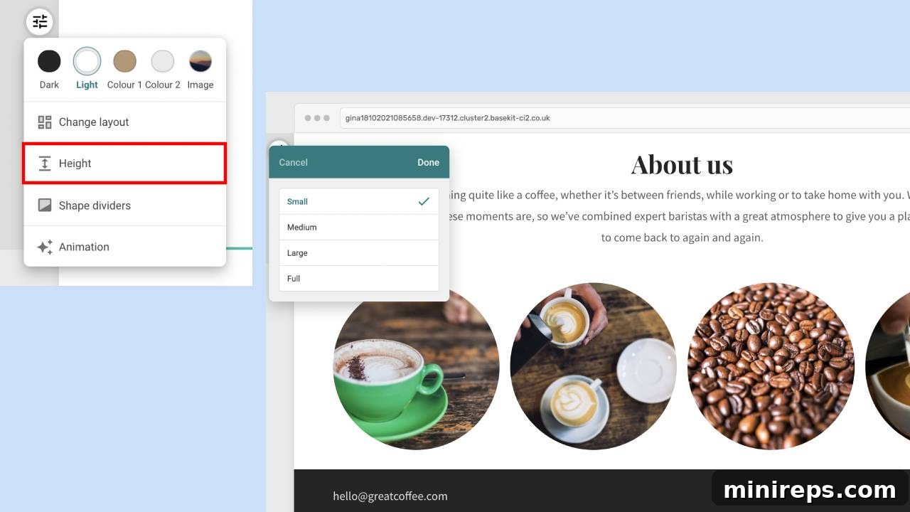
Achieve perfect visual spacing and create impactful layouts with the new Height Settings for Sections, giving you granular control over your page structure:
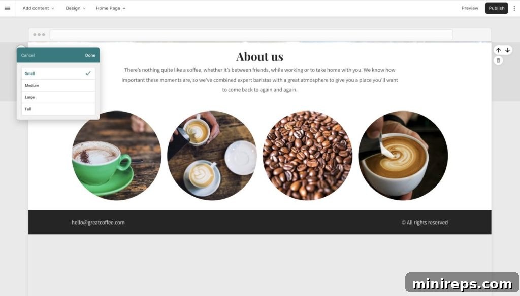
- Flexible Section Height Adjustment: This brand-new feature empowers you to easily increase or reduce the height of any section on your webpage. This flexibility is crucial for achieving balanced layouts, emphasizing content, or creating dramatic visual breaks.
- Intuitive “Appearance” Menu Access: To utilize this feature, simply hover over the desired section to reveal the “Appearance” menu, then select “Height.” The process is quick, direct, and integrated seamlessly into your editing flow.
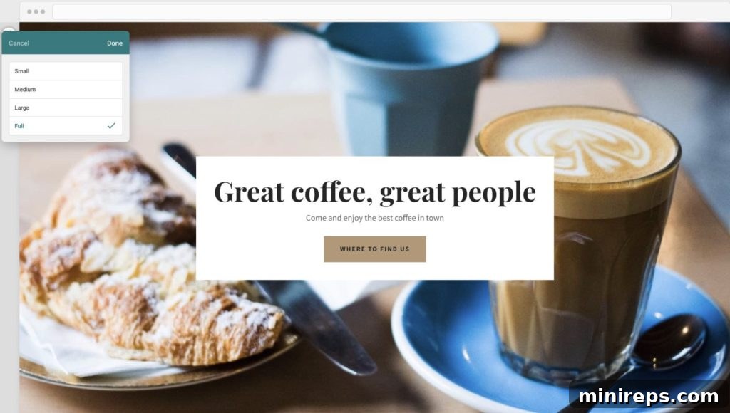
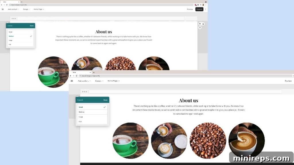
- Four Distinct Height Options: Choose from four thoughtfully designed options: Small, Medium, Large, or Full. These presets allow you to quickly apply common heights that contribute to a professional and consistent design aesthetic.
- Immersive Full-Height Sections: The “Full” height option is perfect for creating stunning hero sections or introductory banners that span the entire width and height of the user’s screen. This creates an immediate, immersive visual impact, capturing visitor attention from the moment they land on your page.
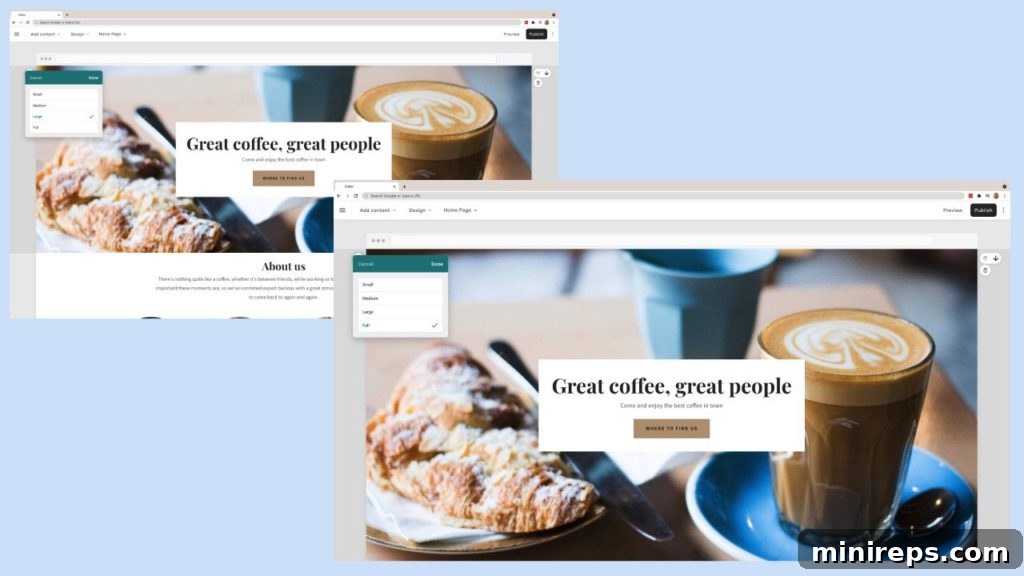
- Compact Small-Height Sections: Conversely, the “Small” height option is ideal for minimizing the vertical space between sections, creating a more compact and continuous flow of content. This is particularly useful for presenting related information closely together or for optimizing above-the-fold content.
Introducing the Fixed Sidebar Template
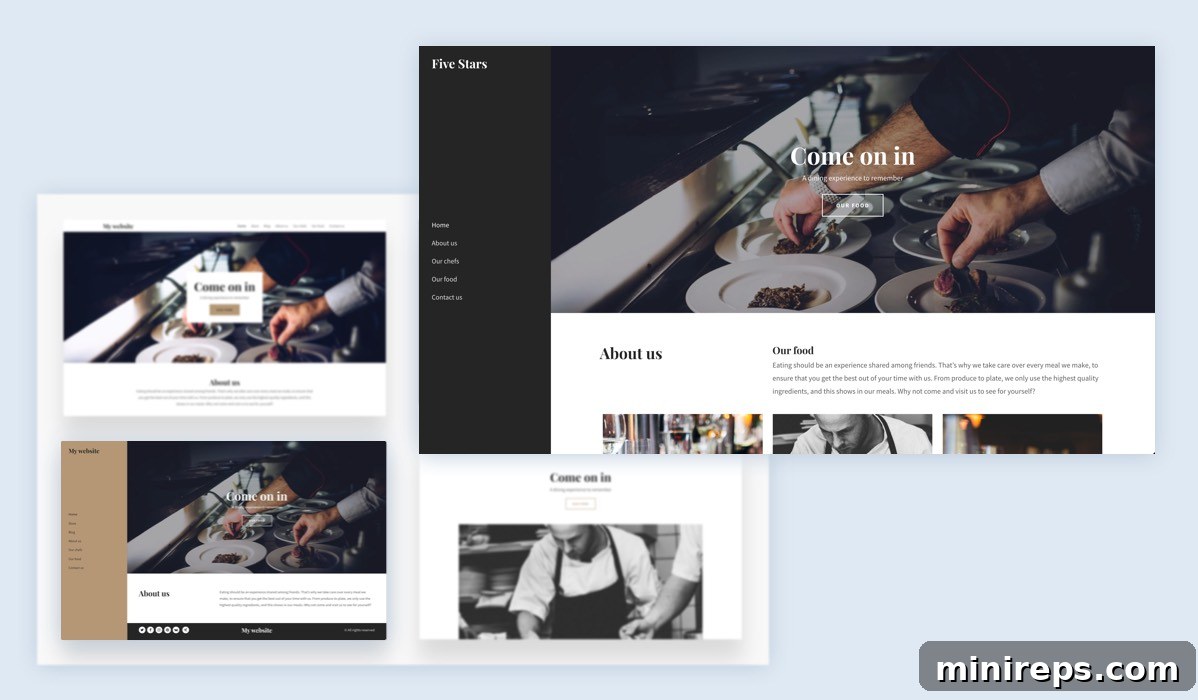
For websites requiring persistent navigation or supplemental content, we’re excited to introduce the new Fixed Sidebar Template:
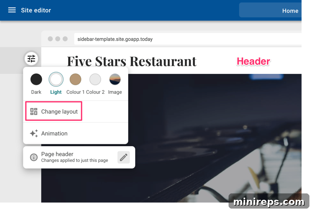
This dynamic layout is readily available as a template during the initial onboarding process, allowing you to kickstart your site with this professional structure. Furthermore, it’s accessible as a shared header layout via the “Change layout” menu within the Easy Website Builder editor, providing flexibility to apply it to existing projects.
The key innovation here is a new sidebar layout that is “fixed” in its position. This means the sidebar, typically housing navigation links, calls to action, or important announcements, remains visible on the screen as the user scrolls down the page. This ensures that crucial information or navigation options are always accessible, enhancing user experience and engagement. This is particularly beneficial for blogs, portfolios, or e-commerce sites where consistent access to categories or product filters is essential.
Enhanced Store Order Page Management
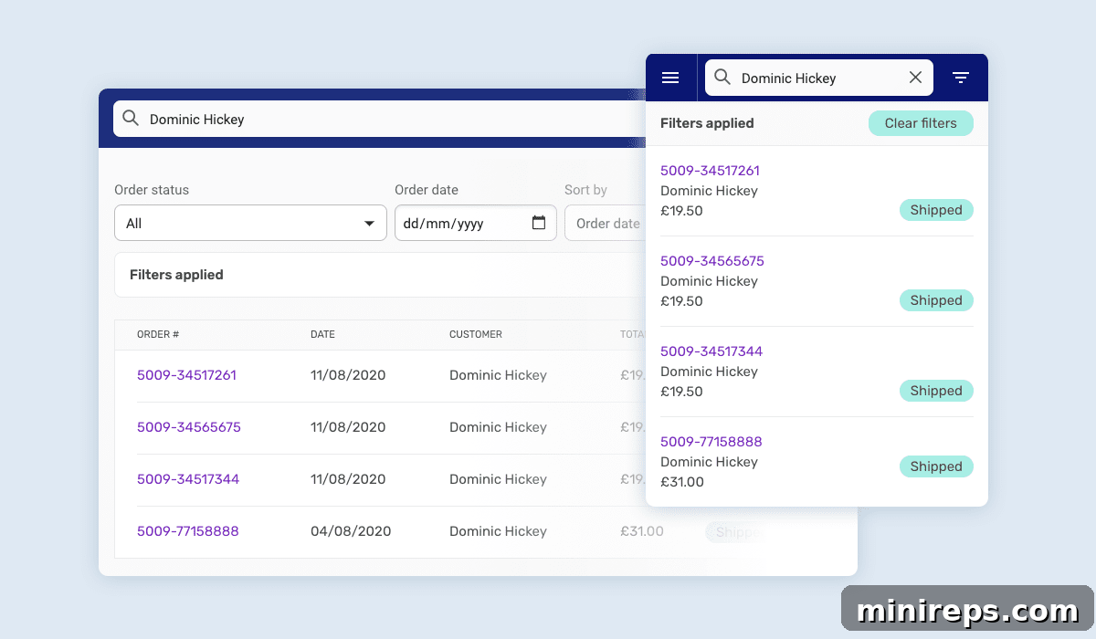
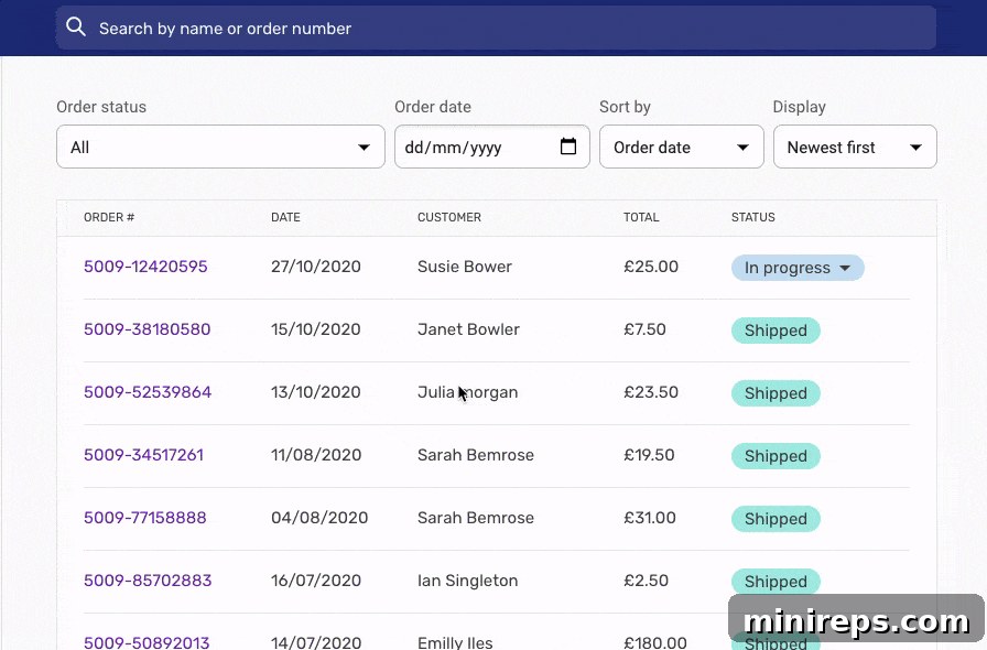
For our e-commerce users, managing your online store has become significantly more efficient and insightful with these store order page improvements:
- Advanced Management and Display Options: The order page now offers a comprehensive suite of tools to manage and display your sales data more effectively, providing a clearer overview of your business operations.
- Intuitive Search Functionality: Quickly locate specific orders or customer details with a robust search feature. You can now effortlessly search by order number or customer name, streamlining customer service and fulfillment processes.
- Flexible Filtering Capabilities: Gain deeper insights into your sales performance with powerful filtering options. Filter orders by their current status (e.g., pending, shipped, completed) and by order date, allowing you to analyze trends and prioritize tasks efficiently.
- Configurable Order Display: Customize how you view your orders. You can now display orders based on their date and age, enabling you to manage recent sales or review historical data with greater ease. These improvements are designed to make order fulfillment and customer relationship management more organized and less time-consuming.
Flexible New Tax Options for E-commerce
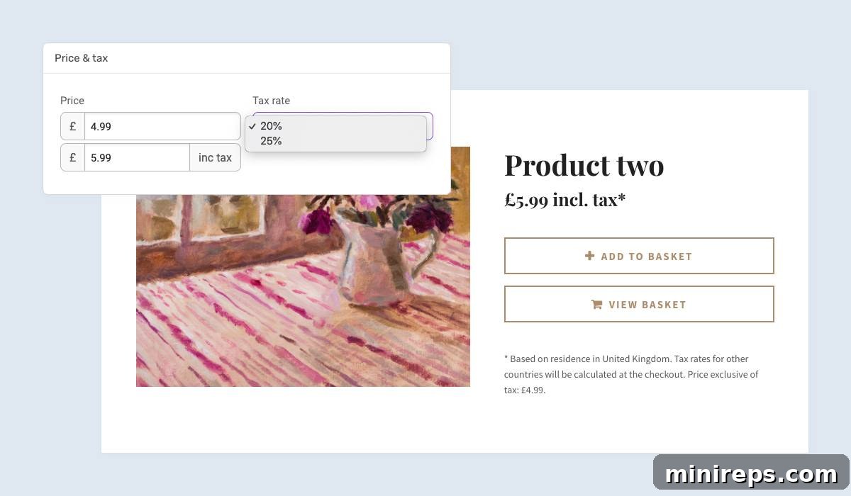
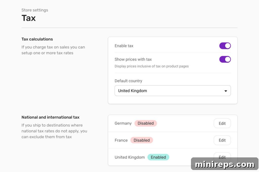
Managing taxes for your online store just got a whole lot simpler and more versatile. Our new tax options provide the flexibility needed for diverse business models and international sales:
Easy Website Builder customers now have the power to set up and manage multiple tax rates, offering unparalleled flexibility in product pricing and legal compliance. You can easily choose which specific tax rate applies to each individual product in your inventory, ensuring accuracy for your customers and your accounting. Furthermore, to cater to global selling, you can effortlessly exclude destination countries where a particular tax rate does not apply. This feature simplifies complex tax calculations, reduces manual errors, and helps businesses comply with varying international tax regulations, making cross-border e-commerce more manageable and profitable.
Final Thoughts: Embracing the Future with the Easy Website Builder Upgrade
We are incredibly proud to unveil this upgraded version of the Easy Website Builder. It represents months of dedicated work, fueled by our unwavering commitment to providing you with the most intuitive, powerful, and enjoyable website creation experience possible. We truly believe these enhancements will not only improve your workflow but also empower you to create more impactful, professional, and mobile-friendly websites with unprecedented ease. This is more than just a software update; it’s a testament to our continuous effort to anticipate your needs and elevate your digital presence.
Your feedback is invaluable to us as we continue to refine and evolve our platform. We encourage you to explore all the new features, experiment with the simplified interface, and discover how effortless building a stunning website can truly be. Should you have any questions, require assistance, or wish to share your thoughts on the new Easy Website Builder, please do not hesitate to reach out to our dedicated support team through our usual support channels. Additionally, we warmly invite you to share your detailed feedback directly with us at [email protected]. We are eager to hear about your experience and how this upgrade helps you achieve your online goals. Thank you for choosing Easy Website Builder – together, let’s build something amazing!